Background CSS
Let's learn the CSS properties for the background.
We are going to learn it with a div tag that is used a lot these days.
So let's start by creating a div tag, putting the text in it, and specifying the background color.
Firstly, create div tag, and then place the text with the p tag In the div tag.
<!DOCTYPE html>
<html>
<head>
<meta charset="utf-8" />
<title>Background CSS</title>
</head>
<body>
    <div>
        <p>
        Hello, my name is disney teyonkin, I Love Disney, Thank you for studying web in my homepage
        </p>
    </div>
</body>
</html>
Let's start by giving the div tag a light blue background in the above source. Its property is background-color :.
div{background-color:skyblue}
<!DOCTYPE html>
<html>
<head>
<meta charset="utf-8" />
<title>background</title>
<style>
div{background-color:skyblue}
</style>
</head>
<body>
    <div>
        <p>
            Hello, my name is David, Thank you for studying web in my homepage.
        </p>
    </div>
</body>
</html>
The result is as follows.

In the CSS, I gave the color value as sky blue, but you can give the value in hexadecimal or the value of rgb.
If you look at programs like Photoshop.
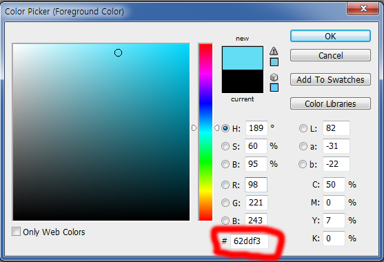
The part shown in red in the picture above is the hexadecimal value of the color.
div{background-color:#62ddf3}
In other words, you can give hexadecimal values as above, and the color, hexadecimal or rgb value can be appled to all tags and css properties.
Then you see the rgb values on the red box.
The RGP value is : R: 98, g: 221, b: 243.
To apply a color value to rgb:
div{background-color:rgb(98,221,243)}
<!DOCTYPE html>
<html>
<head>
<meta charset="utf-8" />
<title>background</title>
<style>
div{background-color:rgb(98,221,243)}
</style>
</head>
<body>
    <div>
        <p>
            Hello, my name is David, Thank you for studying web in my homepage.
        </p>
    </div>
</body>
</html>

Do as above. Rgb is short for Red Green Blue. ^^
However, it would be useful to use hexadecimal value.
Outline setting
Now, let's try to outline the div tag above.
To give an outline, use the border property. And three values are used. You can use it as follows.
div{border:width line, style, color value}
Width refers to the thickness of the outline. 1px 2px 3px and so on.
The second value, line style, is just a line or a dotted line.
The third value, the color value, refers to the outline color. Hexadecimal. Rgb, or English name… Anything is fine, but I use hexadecimal in general. ^^ (And I said using hexadecimal value would be more useful in the long term!)
And when the size of the div is set to 300px and border: 1px is appliked, the div will have the size of 300px, and the will be added to the div.
In other words, if you look at the length including the border, it becomes 302px. (1px for each side!)
So let's see what kind of line style is the second value.
solid : Just one line
dotted : dotted line.
dashed : dotted line.
double : double line.
groove : Three-dimensional expression.
ridge : Convex.
inset : Expressive look
outset : Protruding expression
Let's set the width of the line to 2px, the line style to groove, and the color value to #ff0000.
div{border:2px groove #ff0000}
Apply the above style and type the following source ...
<!DOCTYPE html>
<html>
<head>
<meta charset="utf-8" />
<title>Background CSS</title>
<style>
    div{background-color:skyblue;border:2px groove #ff0000}
</style>
</head>
<body>
<div>
    <p>
        Hello, my name is David, Thank you for studying web in my homepage.
    </p>
</div>
</body>
</html>
The result is like follow…

Then, test this tag by changing the width, line style, and color value in this way.
Rounding corner of the div
Border-radius is used to round the corners.
div{border-radius:value}
You can give the value like 1px, 2px as you want. The larger the value, the more rounded it becomes.
Let's apply it.
<!DOCTYPE html>
<html>
<head>
<meta charset="utf-8" />
<title>Background CSS</title>
<style>
    div{background-color:skyblue;border:2px groove #ff0000;border-radius:10px}
</style>
</head>
<body>
<div>
    <p>
        Hello, my name is David, Thank you for studying web in my homepage.
    </p>
</div>
</body>
</html>

Like the image above, the corners are rounded.
The result looks not so good since the text is too stuck to the left.
In the next lesson, let's learn about margin settings and follow the example above. ^^
But now we are going to keep a lecture on the background ...
Let's put the image as a background.
div{background-image:url('URL');}
The URL of an image to use is /material/images/main/Icon-152.png
Let's apply it. From the bottom, width: is the horizontal value, and height: is the vertical value, which I will explain in detail in the next lesson.
<!DOCTYPE html>
<html>
<head>
<meta charset="utf-8" />
<title>background css</title>
<style>
    div{width:500px;height:300px;
    background-image:url('/material/images/main/Icon-152.png');
    border:2px groove #ff0000;border-radius:10px}
</style>
</head>
<body>
<div>
</div>
</body>
</html>
The result is shown below.
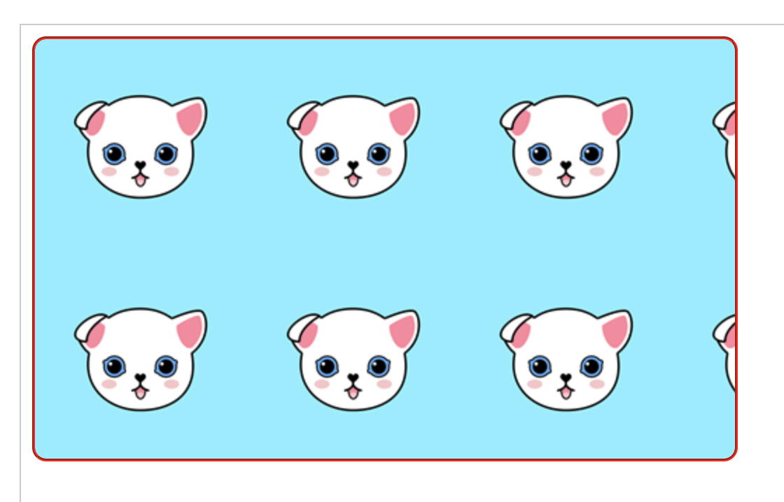
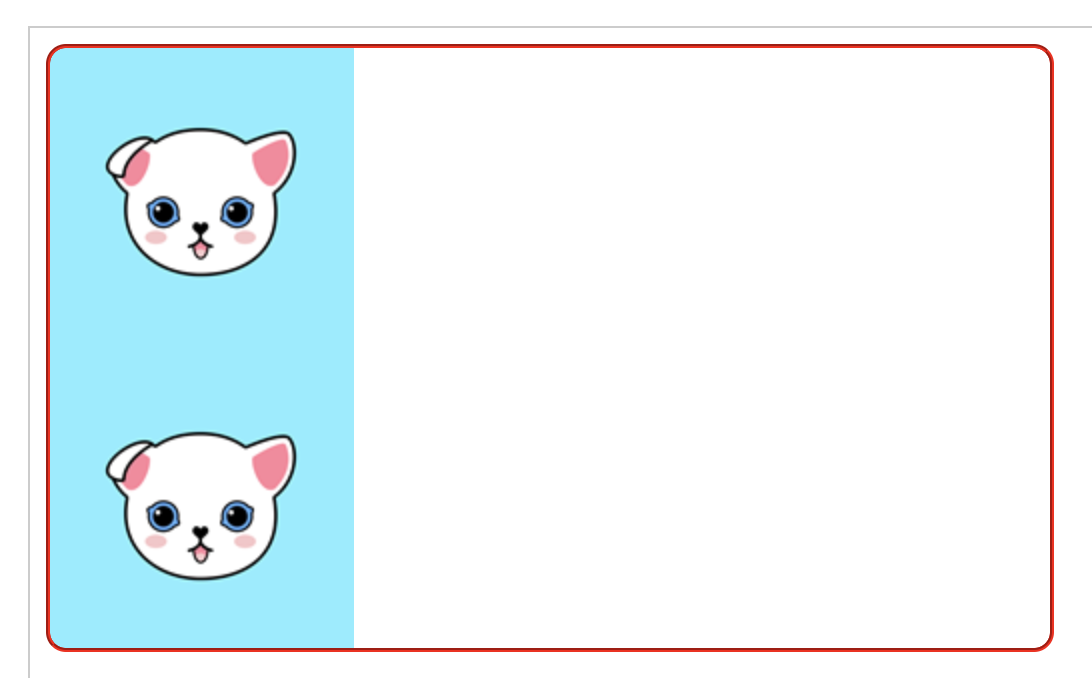
^^ One image repeats horizontally and vertically.
div{background-repeat:value}
There are four ways to set the background-repeat value, and when testing the source above, we are not writing anything.
It seems that repeat is applied by default. Then, let's investigate.
repeat : Background image repeats horizontally and vertically
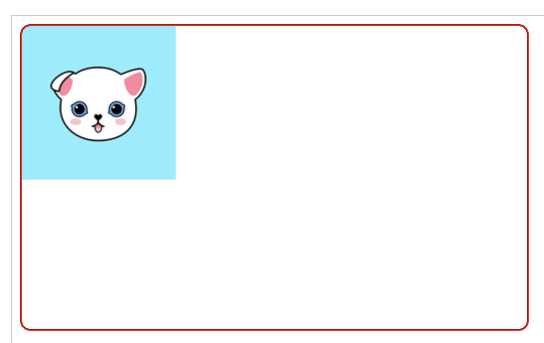
no-repeat : Appears only once
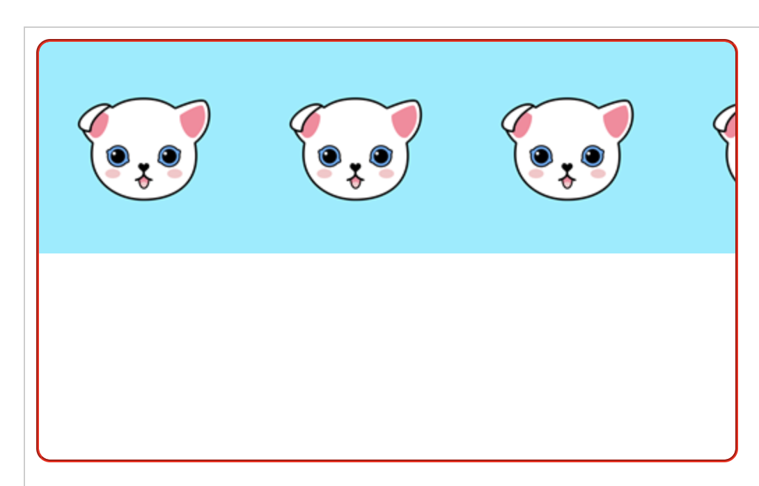
repeat-x : Repeat in the horizontal direction.
repeat-y : Repeat in the vertical direction.
^^ One image is repeated vertically and horizontally.
no-repeat
<!DOCTYPE html>
<html>
<head>
<meta charset="utf-8" />
<title>background css</title>
<style>
    div{width:500px;height:300px;
    background-image:url('/material/images/main/Icon-152.png');
    background-repeat:no-repeat;border:2px groove #ff0000;border-radius:10px}
</style>
</head>
<body>
<div>
</div>
</body>
</html>
The result of above source
repeat-x
<!DOCTYPE html>
<html>
<head>
<meta charset="utf-8" />
<title>background css</title>
<style>
    div{width:500px;height:300px;
    background-image:url('/material/images/main/Icon-152.png');
    background-repeat:repeat-x;border:2px groove #ff0000;border-radius:10px}
</style>
</head>
<body>
<div>
</div>
</body>
</html>
The result of above source
repeat-y
<!DOCTYPE html>
<html>
<head>
<meta charset="utf-8" />
<title>배경 CSS</title>
<style>
    div{width:500px;height:300px;
    background-image:url('/material/images/main/Icon-152.png');
    background-repeat:repeat-y;border:2px groove #ff0000;border-radius:10px}
</style>
</head>
<body>
<div>
</div>
</body>
</html>
The result of above source
Background location setting
You can also set the position of the background image above.
The horizontal value has left, center, right,%.
Vertical values include top, center, bottom,%.
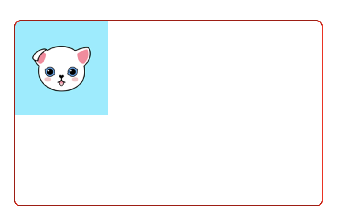
To place it in the upper left corner,
div{background-position:left top}
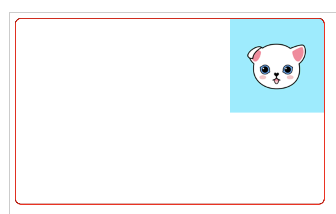
To place it in the upper right corner
div{background-position:right top}
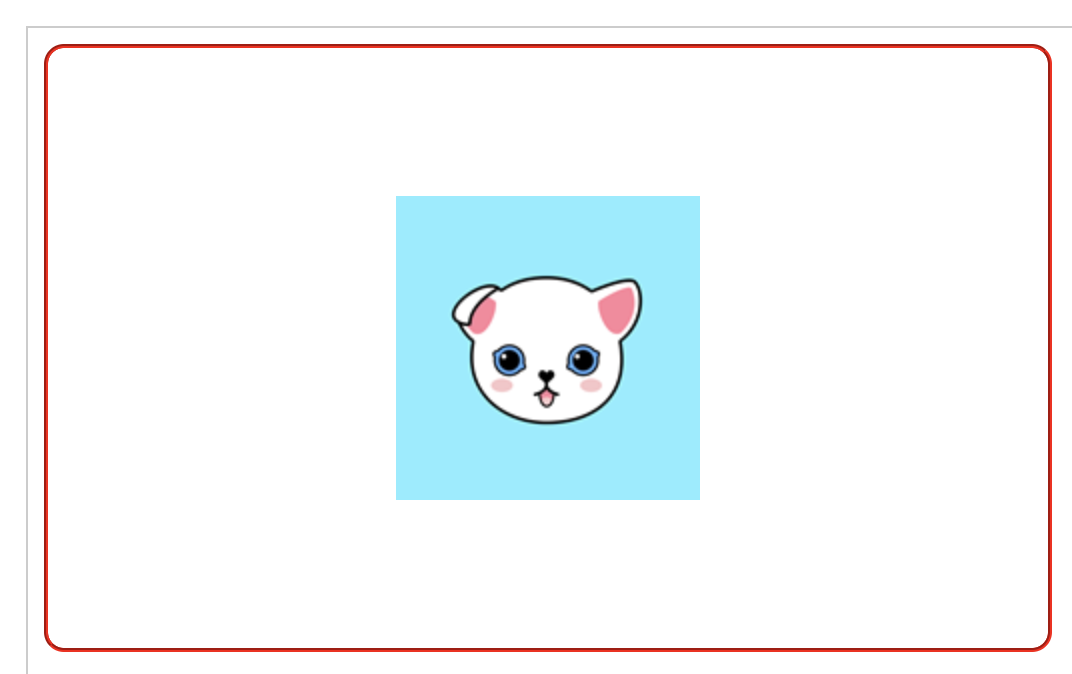
To place it in center
div{background-position:center center}
To place it in the bottom of the center,
div{background-position:center bottom}
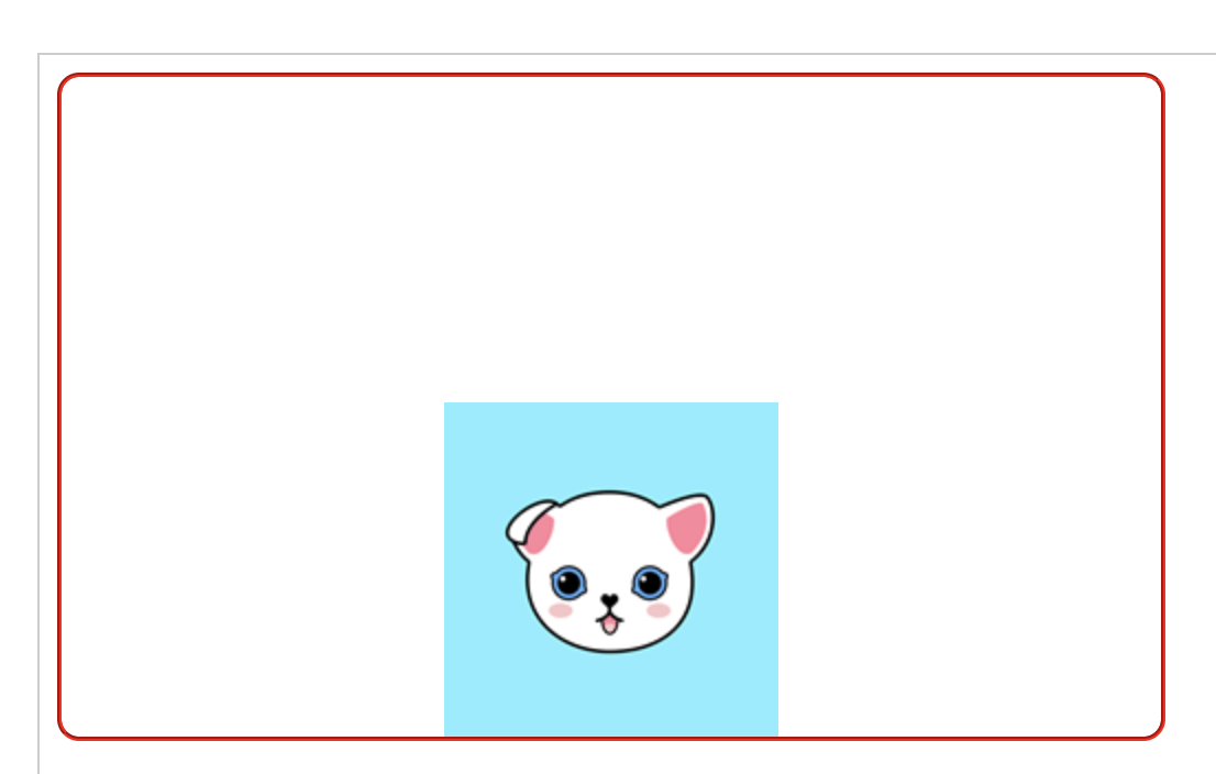
To position it in the upper left corner by *%,
div{background-position:0% 0%}

To place it slightly further to the right from the center,
div{background-position:70% 50%}
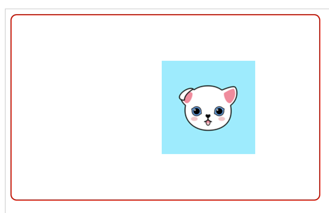
Creating a scroll bar
Let's say that we have a height of 300px in the div, and the text in it is too long.
If you want to have a scroll bar….
div{overflow:scroll}
Overflow means that what will happen if the contents in the div is bigger than div. If you give hidden in the CSS, the passing part turns into hiding, not being shown. If you use scroll, you also get a scroll bar.
Let's test it.
<!DOCTYPE html>
<html>
<head>
<meta charset="utf-8" />
<title>background CSS</title>
<style>
	div{width:500px;height:300px;
    background-image:url('/material/images/main/Icon-152.png');
	background-repeat:no-repeat;border:2px groove #ff0000;
    border-radius:10px;overflow:scroll}
</style>
</head>
<body>
<div>
Apple looks set to be opening a ninth Apple Store in Japan. The company is currently recruiting all the usual store positions in the city of Kyoto …

The job listings went live today and were spotted by Macotakara. Apple is recruiting for all roles from Store Manager through Leader, Creative, Expert, Genius, Inventory Specialist, Service Specialist, Specialist and Senior Manager.
Appropriately enough, Kyoto is the 9th largest city in Japan, with a population of around 1.5m, and a popular tourist destination. In older times, it was the capital of Japan, and is known for its Imperial palaces and more than 2,000 Buddhist temples and Shinto shrines. It escaped any bombing in the war, so also has many traditional wooden houses.
Apple currently has seven full Apple Stores in Japan, three of them located in Tokyo with the others in Fukuoka, Aichi, Osaka, and Miyagi. Additionally, the company has a dedicated Apple Watch store in Shinjuku, on the outskirts of Tokyo. Macotakara notes that it also used to have a store in Sapporo, later closed.
</div>
</body>
</html>
You can use it as a web editor or in your own editor. ^^ Test overflow: scroll with overflow: hidden in web editor.
And try eliminating the overflow completely.
Controls whether the background image is anchored
here is a background on the div in the above source. The background is scrolling down when you scroll the screen down, so you can always change the background so that it is always on the spot.
kind of value scroll : Scroll to scroll the background.
fixed : As you scroll, the background stays there.
So let's test ... first from background scrolling
<!DOCTYPE html>
<html>
<head>
<meta charset="utf-8" />
<title>background CSS</title>
<style>
div{width:300px;height:300px;
    background-image:url('/material/images/main/Icon-152.png');
background-repeat:no-repeat;
    border:2px groove #ff0000;border-radius:10px;
    background-attachment:scroll}
</style>
</head>
<body>
<div>
Apple looks set to be opening a ninth Apple Store in Japan. The company is currently recruiting all the usual store positions in the city of Kyoto …

The job listings went live today and were spotted by Macotakara. Apple is recruiting for all roles from Store Manager through Leader, Creative, Expert, Genius, Inventory Specialist, Service Specialist, Specialist and Senior Manager.
Appropriately enough, Kyoto is the 9th largest city in Japan, with a population of around 1.5m, and a popular tourist destination. In older times, it was the capital of Japan, and is known for its Imperial palaces and more than 2,000 Buddhist temples and Shinto shrines. It escaped any bombing in the war, so also has many traditional wooden houses.
Apple currently has seven full Apple Stores in Japan, three of them located in Tokyo with the others in Fukuoka, Aichi, Osaka, and Miyagi. Additionally, the company has a dedicated Apple Watch store in Shinjuku, on the outskirts of Tokyo. Macotakara notes that it also used to have a store in Sapporo, later closed.
</div>
</body>
</html>
Hmmmmmmmmmmm It strange I am not getting the proper result. Anyway it is like what I explained.


